My primary challenge is to make web sites, mobile solutions and other applications look good and be easy to use. I work carefully with prototypes as the main tool to ensure the usability in all kinds of digital devices.
Interface & interaction design
As the number of systems in our lives grow and grow simplicity and effectiveness becomes more and more important as success factors. Usability as I see it is basically to reduce the effort required from a user when using an interactive products or service. If the pain is grater than the gain the user will probably not come back or try in any way to avoid using it.
The goal is a positive user experience
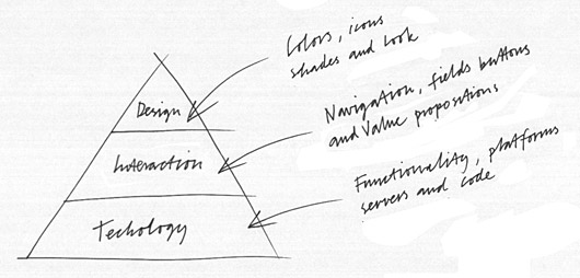
All user experience is based on the technology. If the system is not working as the user expects all work with interaction design and fancy graphics will be in vain. A pleasant user experience is acheved when a balance between the functionaliy, interaction and the graphic design can be presented to the user.
Most people would choose a good looking interface istead of an uggly one. However, if the interface the underlying technology does not work as the user expects then even the most slick looking usable interface just becomes an empty shell. If the interaction and the technology works fine but looks awful the The interaction slick and good looking interface just becomes an empty shell. You migt say that the How you interact with the software is You might say that the functionality is the foundation of the user experience.
Logical, clear and intuitive
Using an interactive solution should not require the user to stop and think. The interface must there for followi a clear logic in it’s disposition be very clear on what the value propostition in every part. The users preception and recognition can be further enabled by the use of icons and other graphic elements. Appart from logical and apparent the interface also needs to be self explaining. Users of today tend to throw away the manual and read very few instructions and have little patience if they get confused.
Adapting known patterns
I get inspiration by, or you might say steal, ideas and solutions from popular services and application when designing an interface. There is no need to invent the weel and if an operation is elegantly solved in a popular service frequently i bare no grudges against using that. This is called interaction patterns and is an effective way of working effectively with an interface. However, I’m always careful to adapt an interactional pattern to the current concept
Prototypes as a final delivery
The most common deliverable when I do an interaction design project is a prototype. This prototype is normally created as a wire frame bu might just as well be presented in final design, all depending on the circumstance. Limited interactivity is an important part of the prototype in order for the client and other parties involved to get a feel for how the live application or site would work. In addition to the graphic prototype i also offer writing a detailed specification for each page or logical view in the solution. This is because there will always be design decisions and considerations not visible in the pages themselfs.


