Hi, I’m Jonas Björkman from The art of job. I had the pleasure of working with Mårten Angner during the redesign of merajobb.se. This was my first project with Mårten and his way of working was both productive and efficient. Sometimes effectiveness can stand in the way of creativity but in this project I would say quite the contrary, Mårtens input did always contribute to my work.
Mårten is full of energy and great ideas, I would recommend him in a heartbeat!
I’ve been working as an art director and designer for many years and in a great number of projects. I work mostly with print but sometimes also with digital media. A couple of years a go I designed the first version of the merajobb.se site, I was therefore pleased to be engaged in the redesign. It was needed, obviously a lot has changed on the internet in the past few years and giving the site a new look would most definitely help the site to thrive.
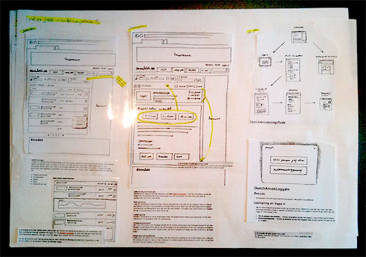
Before I entered the scene Mårten had constructed the concept using hand drawn sketches in a highly structured manor. Working with Mårtens prominent paper sketches made the entire project not only do-able but also enjoyable which was a challenge considering the short period of time that we had. The entire process was very disciplined and specifications were clearly expressed, however it still left me ample room to be creative and set the tone according to my own creative pace.
The sketches was presented in a wiki accompanied by descriptions. I found them to be very informative and they made the different parts of the future site easy to grasp and it was clear how they were to be put together. To get more of the overview I needed in order to design the site I printed all the sketches and mounted them on A2 papers.With all the sketches in front of me the design process could begin.
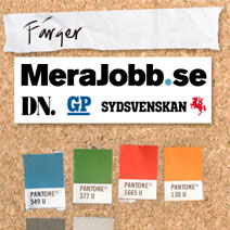
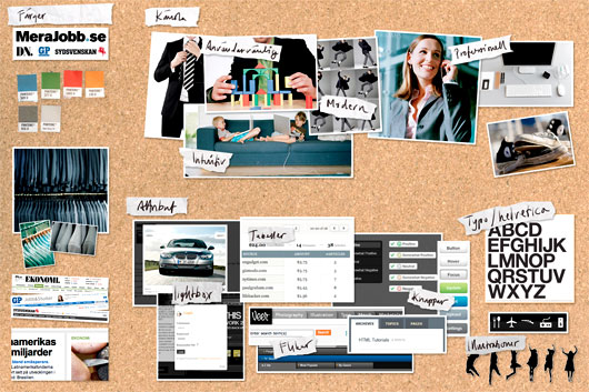
The project mood board was put together in order to get a sense of design direction and the aesthetics quality of the future site.
The site should have a new and updated feeling to it, but I still wanted it to be similiar to how news papers look and feel since the site is a collaboration between Sweden’s three major morning papers Sydvenskan, DN and GP. I created the project mood board to assimilate the sites purpose in one clear vision.
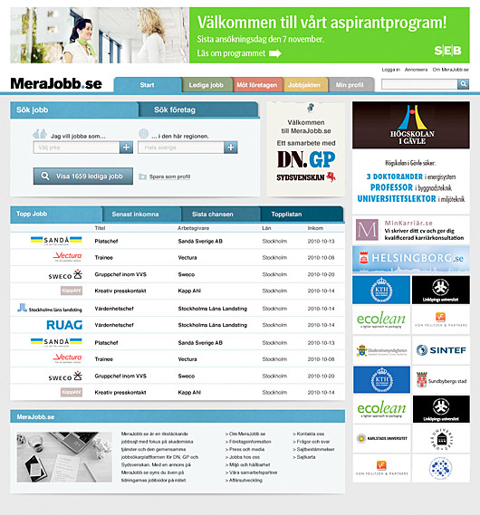
The final design of the front page of the merajobb.se site
Mårten is full of energy and great ideas, I would recommend him in a heart beat. In his field of profession he has clearly gathered a lot of working experience and with Mårten at the steering wheel there isn’t any doubt where the project is heading. This added confidence and calm to the entire team and helped me focus on the esthetics aspects on the site without distractions. In some projects the structure can suficate the creative part but that wasn’t the case when working with Mårten. During the entire re-design we kept close contact and I often used Mårten as a sounding board to clear ideas since his input always contributed to my work.


