We at Box Experience’s wanted to improve our web site. Our web agency called in interaction designer and usability expert Mårten Angner to conduct an eye tracking study on our site. The study fully confirmed our suspicions about usability problems and provided valuable insight into how our customer’s think. Mårten presented clear directions on how to take our site to the next level. Almost like a how‑to‑guide, created exclusively for us!
Mårten’s eye tracking study became a how‑to‑guide for creating a successful site
We at Box Experience have been selling experiences for every possible occasion since 2003. We offer our products both through physical stores and our web site. What differentiates Box Experience from our competitors is the product itself – experiences handpicked for their quality and exclusivity, presented and packaged in a very exclusive box.
The web site is our primary channel for promoting and selling our products. Our previous site has been around for quite some time and has served us well. However, some users have experienced difficulties performing basic tasks and seem to have had problems finding their way around the site. We suspected usability problems in the ordering process. Some of our customers called customer service after trying to claim their gift but couldn’t figure out how to do it with the help of the site. We decided to redesign our web site to make it simpler, with fewer steps and each screen less cluttered.
We asked our web agency, Paregos, to help us with this. Our goal was to design a site that was super simple and that all our customers could use without effort. Paregos recommended a Usability study as the first step of this process.
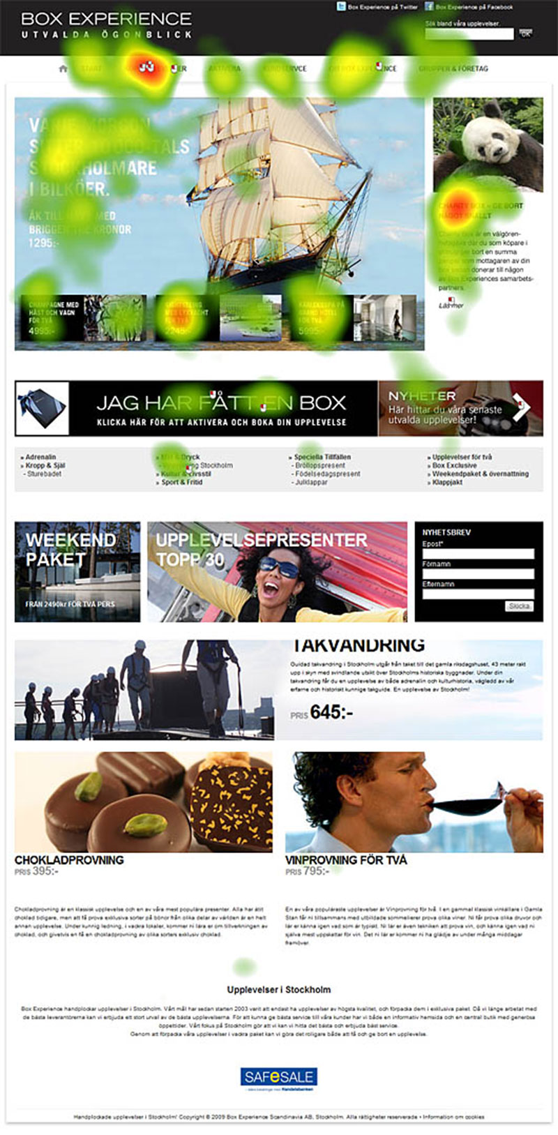
Heat map presentation of the eye tracking data recorded for the start page during the study of the Box Experience site. The users showed hesitation when trying to figure out how to book their experience: They did not seem to understand the menu item “Activate” presented in the main menu. The alternative way, the banner “I have received a box”, was mistaken for a simple advertisement. The many horizontal objects on the site gave some users the impression that they viewed the end of the page. Consequently, they did not start scrolling to see the offers on the bottom of the page.
For the task Paregos called in the interaction designer Mårten Angner to evaluate the site. Mårten is one of Sweden’s most experienced usability consultants and an expert in conducting eye-tracking studies, and has an impressive track record in the field.
I must say that it was fascinating to watch a user in action on my site! The study of the Box Experience web shop was both professionally planned and executed and was truly interesting to be a part of. I participated during a test session. As it turns out, users had problems with things we until now didn’t even think of and the experience gave me new insight into my business.
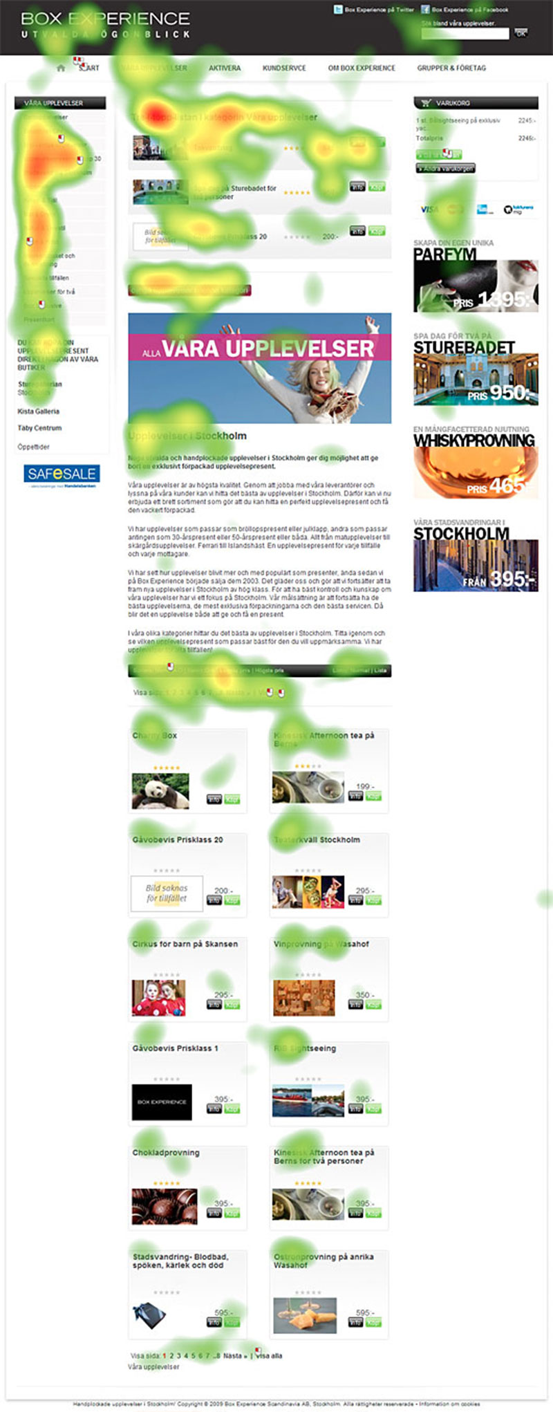
Perhaps the most interesting fact unveiled in the study was that I discovered that the users did not understand the wide range and number of experiences in our assortment. The users focused on the featured experience and were disappointed. After this negative impression the users were reluctant to explore the site further. This gives great insights into how to improve the site. Or, as Mårten concluded:
We have to show an abundance of experiences right of the bat. The users seem to have a fixed budget and by arranging the experience by price we can let the users scroll through the experiences until they find the ones in their price range. Maybe we could add some filter functionality at the top of the page, but this is truly secondary. Based on the test data, this must be the most natural interaction for the users.
The test data recorded by the eye tracker was the analyzed by Mårten and the design team at Paregos. After a few days the full result of the study was presented. The test concluded that both major and minor adjustments were needed in order to make the site easier to use. Here are some of the main issues put forth:
- The users had difficulties finding where to claim their received gift on the site. A simpler and more intuitive process needed to be created.
- The site used the word “Activate” to describe how to book the experience. No user seemed to understand what this implied. Technical terms needed to be replaced with simpler and more direct words.
- Users perceived the option “I have received a box” as advertising and it took a long time before they found this option.
- The design did not encourage the users to scroll the pages, which made them miss important offers. Use more of the page width to present the key content was needful in order to inspire the users and give them the incentive to explore the pages.
The conclusion from the study more or less confirmed what we suspected beforehand based on feedback from our customer. Still, having it all in black on white was of great importance for us. I see the value in applying a scientific approach. Moreover, the study report itself proved to be almost like a how-to guide for creating a successful site.
Mårten’s eye tracking study provided, in great detail, the supporting evidence we needed to move forward. In fact, the study report was presented with all suggestions of improvements arranged in a step by step fashion, almost like a how-to-guide on how we could improve our site. With all these good advice it was the most natural thing to invite Mårten to, together with Paregos, continue the work in the redesign process of the next generation of Box Experience web shop.
Mårten came across to me as very committed and knowledgeable within this field and I would recommend Mårten to other managers in my position.


