Will front page carousels improve your conversion rate?
Top Carusel, front page slider, the thing on the top of web sites has many names. It is also deeply loved by designers and clients. Having content slide across the page feels like both good investment of screen estate and manages to show multiple offers to the site visitor. It seems like a match made in heaven. But does it really perform well to boost conversion?
For the second edition of Conversion jam in Stockholm I was invited to present my experiences from evaluating sites containing top sliders.
For some reason Conversion Experts have doubts regarding frontpage sliders. Some outright hate it. To validate this myself, John Ekman and the rest of the team at Conversionista has created a comparative study when a top slider goes head to head with a conversion optimized version at the exact same size and location on the site. The two versions was studies both using Eye-tracking and A/B-testing using Visual Website Optimizer.
We call it the Pet shop carousel showdown!
The site made up for the competition was grizzlyzoo.se, a small online pet shop targeting Swedish consumers.
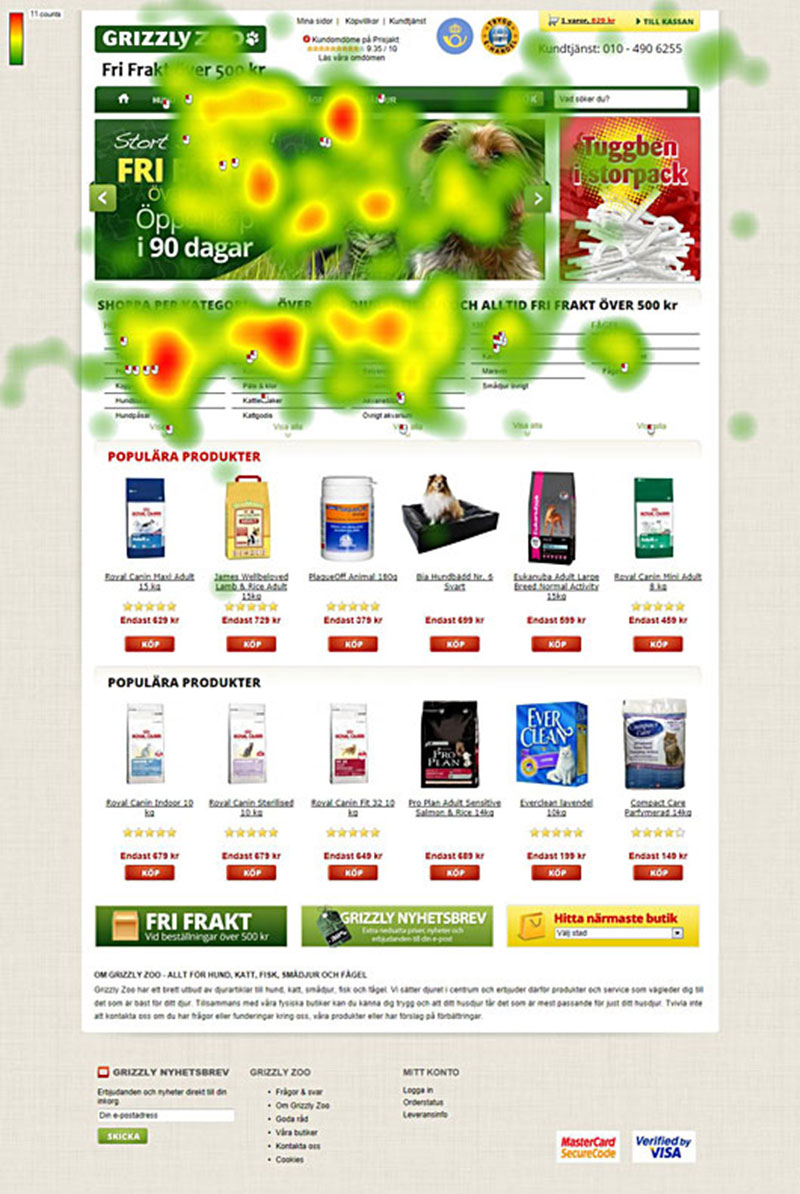
The site has a classic slider with branding qualities as well as a targeted message for dog owners. This is the Control, A, in this study. The user confronted with this version seemed to avoid the slider and did not click on it. The only substantial eye-tracking data that manage to stick on the slider is the area were the dynamic menu drop downs expanded on top of the image.
The original top slider on Grizzlyzoo.se. Let’s see how it works compared to a conversion optimized static top area!
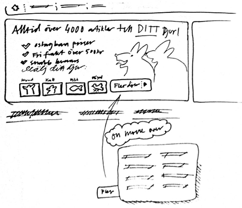
A new concept was developed based on the behavior of the test-users and then handed over to the graphic designer who finished the new design.
The new version was conversion optimized and had a static image with the possibility to choose your pet with buttons in the image. The theory behind this suggestion is for the user to select their pet initially, and then, on the category page manage to create offers tailored for the respective target group. By doing this, the hypothesis was, to manage to improve the value of the screen estate were the top banner was located.
The new version of the Grizzlyzoo.se top area. Here with a static design made for early interaction with the customers. Let’s see how it compared with the original slider!
The eye tracking date show a drastically improved interest for the top area and a substantial amount of users also chose to click on the new version.
The study shows clear indications that a static conversion optimized top area is more interesting to the users and leads to more engagement!
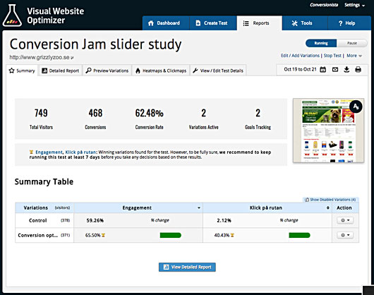
The A/B-testing result of the public site was totally in line with the eye-tracking study. After the two versions was split tested a couple of days the result, even though being a small sample spoke louder than words. The old version of the site only got 2,06% clicks while the optimized version got 40,53% clicks. The overall engagement also improved slightly.
It seems sliders have a negative effect on e-commerce web sites but in order to know more we need to do more testing. Let’s stay in touch to see the result of more testing around this idea!